Prosper Loan Exploratory Data Analysis
By Jianru Shi
Introdcution
This project is part of the Udacity Data Analyst Nano Degree Program. I conducted an Exploratory Data Analysis (EDA) on a data set from Prosper, which is America’s first marketplace lending platform, with over $9 billion in funded loans. This data set contains 113,937 loans with 81 variables on each loan, including loan amount, borrower rate (or interest rate), current loan status, borrower income, borrower employment status, borrower credit history, and the latest payment information.
The main purposes of this project are to summarize the characteristics of variables that can affect the loan status and to get some ideas about the relationships among multiple variables using summary statistics and data visualizations.
The outline of this project is:
- Introduction
- Univariate Plots Section
- Univariate Analysis
- Bivariate Plots Section
- Bivariate Analysis
- Multivariate Plots Section
- Multivariate Analysis
- Final Plots and Summary
- Reflection
Univariate Plots Section
BorrowerAPR and BorrowerRate
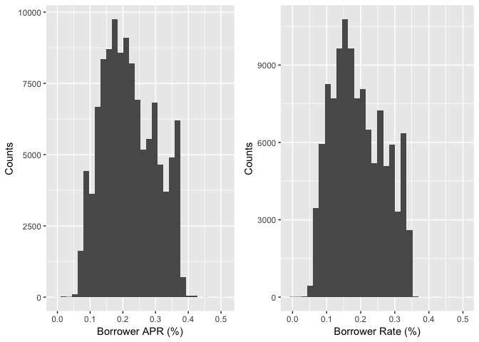
The BorrowerRate (interest rate) refers to the annual cost of a loan to a borrower and is expressed as a percentage. The interest rate does not include fees charged for the loan. The BorrowerAPR is the annual cost of a loan to a borrower. Unlike an interest rate, it includes other charges or fees (such as mortgage insurance, most closing costs, discount points and loan origination fees) to reflect the total cost of the loan.
According to above definitions by Bank of America, the distribution of BorrowerAPR and BorrowerRate should be similar with slight difference since the APR is always higher than the interest rate.
ProsperScore
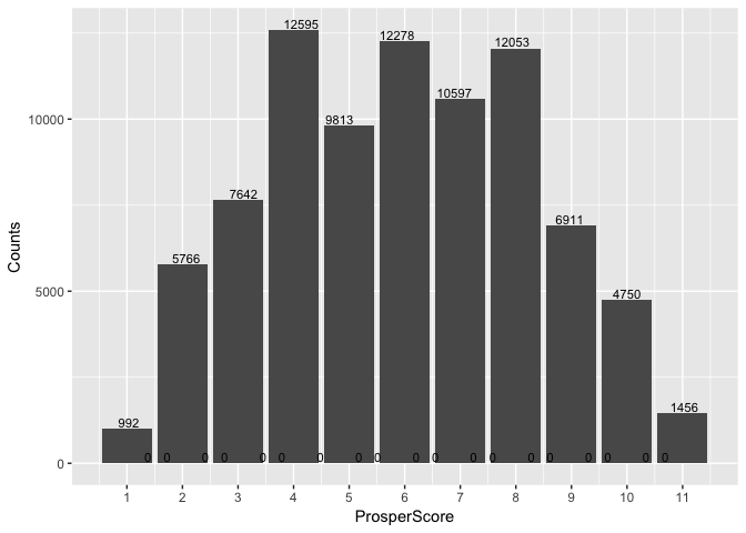
ProsperScore is a custom risk score built using historical Prosper data. The score ranges from 1-10, with 10 being the best, or lowest risk score.
StatedMonthlyIncome
StatedMonthlyIncome is the monthly income the borrower stated at the time when the listing was created.
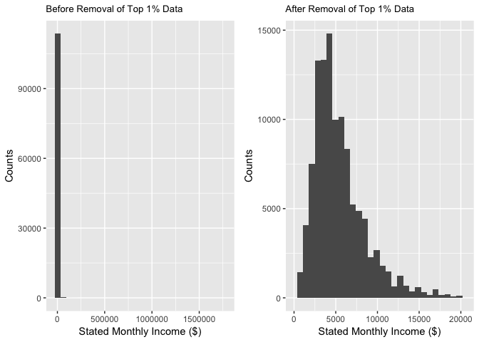
The histogram plot of the original data is highly right skewed. To find the outliers that drive data to the left, I used summary function and find that the maximum value is 1750000, which is likely to be an error. So in the next plot, I removed the top 1% data from the original and got a more reasonable plot.
##    Min. 1st Qu.  Median    Mean 3rd Qu.    Max.
##       0    3200    4667    5608    6825 1750000
MonthlyLoanPayment
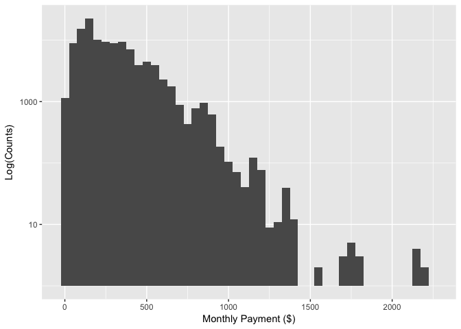
MonthlyLoanPayment is the monthly payment made by the borrower.
From the histogram I found that most of Prosper loan are less than 1,000 ($), indicates the prospers services are mainly on personal loans.
## Warning: Transformation introduced infinite values in continuous y-axis

## Warning: Removed 6 rows containing missing values (geom_bar).
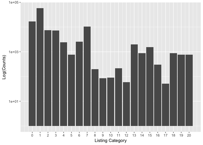
ListingCategory
ListingCategory is the category of listing. Prosper uses numeric values to represent the categories. The meanings of each number can be found on the Documentation.
From the barplot, I found that the most popular services offered by Prosper are Debt Consolidation, Home Improvement, and Business.
AvailableBankcardCredit
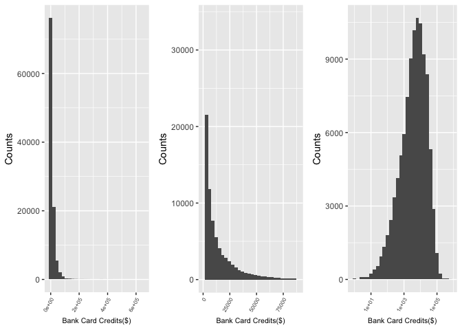
AvailableBankcardCredit is the total available credit via bank card at the time the credit profile was pulled.
LoanStatus
New variable: check_defaults
In risk management one important job is to build a predictive model to predict whether the loan will be default or not. So I created a new dummy variable ‘check_default’ using ‘0’ to represent a completed loan and ‘1’ to represent a default or charged off loan. According to Lending Club: In general, a note goes into Default status when it is 121 or more days past due. When a note is in Default status, Charge Off occurs no later than 150 days past due (i.e. No later than 30 days after the Default status is reached) when there is no reasonable expectation of sufficient payment to prevent the charge off.
Occupation
Occupation is the occupation selected by the Borrower at the time they created the listing.
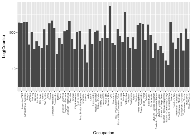
Since occupation is a catagorical variable, I first plot the histogram. The range of the counts for occupations expands from less than 100 to 10,000 magnitude.
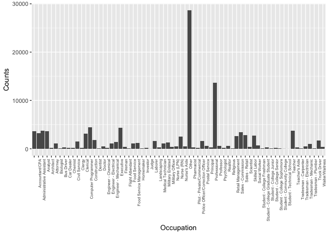
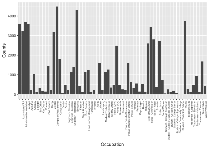
To make small changes visible, I plot the barplot of occupation on a log scale. From the histogram I found the ‘Other’ and ‘Professional’ have the largest counts, but these two options didn’t provide us useful information. So I created subset of the original data and made a bar plot to visualize the distribution of the occupations.
After removing the ‘Others’ and ‘Professional’ data, the top three occupations counts are ‘computer programmer’,’Excutives’, and ‘Teacher’.
CreditGrade
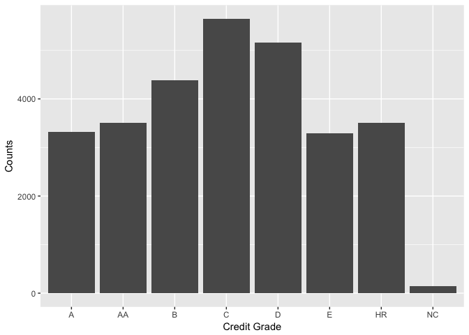
CreditGrade is the credic rating was assigned at the time the listing went live.
Univariate Analysis
What is the structure of your dataset?
The dataset has 113937 observations of 81 variables. Data types including ‘factor’, ‘num’, and ‘int’. Variables are about loan information and borrower information.
What is/are the main feature(s) of interest in your dataset?
As a potential borrower, I am interested in the interest rate and APR of the loan. So I plot this two variables and found their ranges lie between 0.1-0.4. I learned that APR is the interest rate plus some fees, so it is always a little bit higher than the interest rate. A further investigation is needed since to find the accurate APR for a particular loan other factors such as time and personal credit history have to be considered.
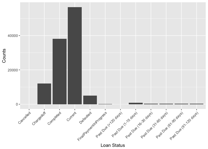
Another interesting variable is the LoanStatus, which is the status a loan described as ‘completed’, ‘chargedoff’, ‘defualt’, ‘current’, ‘overdue’ et al. This information can be used to build a predictive model for risk management in bank or financial institution like Prosper. I used a bar plot to visualize the counts of all status and found that most of loans are completed. However, about half of the closed loans (exclude current loans) are marked as ‘chargedoff’ or ‘default’.
What other features in the dataset do you think will help support your
investigation into your feature(s) of interest?
To study the borrower interest rate and loan status, I included ListingCreationDate and some borrower information such as Occupation, AvailableBankcardCredit, CreditGrade, StatedMonthlyIncome and DebtToIncomeRatio.
Did you create any new variables from existing variables in the dataset?
Yes, I first created a new dummy variable ‘check_default’ to indicates whether a loan is completed or not. I also created a Datetime variable ‘ListingDateTime’ in format of ‘yyyy-mm-dd’ to indicate the loan listing date.
Of the features you investigated, were there any unusual distributions?
Did you perform any operations on the data to tidy, adjust, or change the form of the data? If so, why did you do this?
The StatedMonthlyIncome is highly right skewed. To find the outliers that drive data to the left, I used summary function and find that the maximum value is 1750000, which is likely to be an error. So in the next plot, I removed the top 1% data from the original and got a more reasonable plot.
Similarly, the AvailableBankcardCredit is also extremely skewed. I first removed the the top 1% data from the original and result distribution looks like a gamma distribution. To normalize the data I did a log transformation on the variable and get a nicer plot, which allows us to better observe the data behavior.
Bivariate Plots Section
Scatter matrix plot.
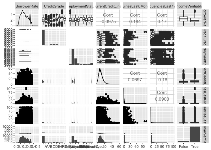
Scatter matrix plot is a fast way to compare multiple paired variables at once. So I first used the ggpairs function to get a general idea of the correlations amoung the variables. The variables included in the matrix plot are BorrowerRate (the variable I am interested with) and other variables associated with the borrowers, such as credit history and employment status. The scatter matrix shows that the credit grade is clearly one factor affect the interest rate. The correlation coefficient of other variables with the interest rate are very small, therefore, will be excluded from the predictive model.
Time vs. Interest Rate
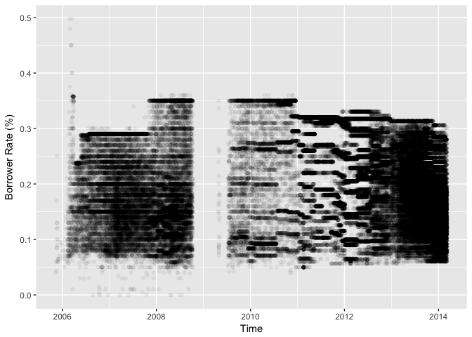
To study how did interest rates change with time, I made a time series plot using scatter plot. However, the plot failed to illustrate any useful information since there are too many observations.
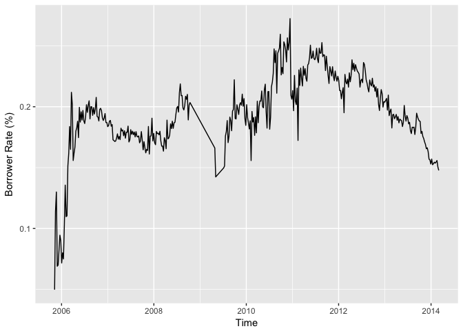
Therefore I made the second plot with weekly means. The plot looks better now but it is too noize.
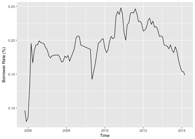
To reduce the noises, I changed the x unit from Week to Month. Now the plot shows clearly how interest rates changed over time. However, there’s no obvious seasonal fluctuation or monotonic behaviors. Time may not be a good independent variable to predict the borrower’s interest rate.
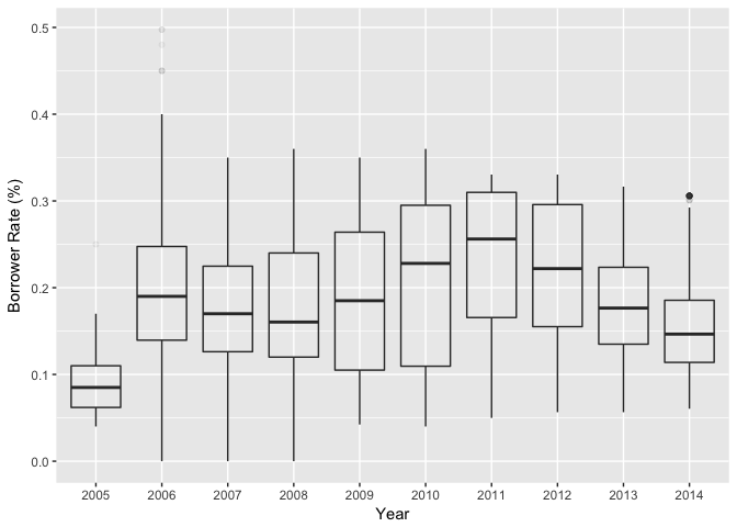
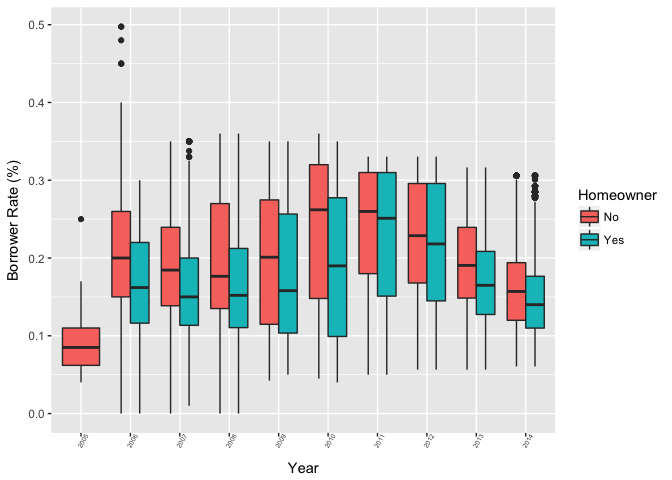
Yearly Borrower Rates
Prosper Rating vs. BorrowerRate
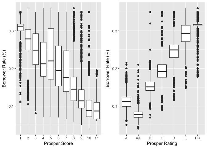
ProsperScore is the custom risk score built using historical Prosper data. The score ranges from 1-10, with 10 being the best, or lowest risk score. ProsperRating is a similar parameter to evaluate a customer’s risk to make default loan.
The plot show strong correlation between the prosper rating/score with the borrower’s rate. Generally, borrowers have no clue on their prosper scores. So these information can not be included in our model.
AvailableBankcardCredit vs. BorrowerRate
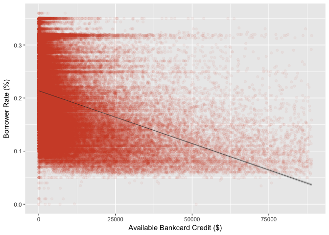
AvailableBankcardCredit is total available credit via bank card. It can be an indicator of a borrower’s credit history.
A reasonable guess is that a higher available bank card credit will lower your interest rate. This guess is proved to be true from following plot. The points are clustered at the bottom left corner, when a borrower has relatively low credit amount (<25,000) the probabilities of getting low and high interest rates are similar. However, when the borrower’s credit amount is high (>50,000), he/she is more likely to get a lower interest rate.
MonthlyLoanPayment vs. Occupations
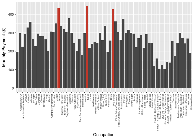
The top 3 occupations have high monthly loan payment are Judge, Doctor, and Pharmacist. The monthly loan payment should be positively correlated with the salary. The plot is consistent with salaries of each occupation. For examples, the top 3 listed occupations are all best-paying jobs accoring to CNBC, and the groups that have lower monthly loan payment are students.
LoanStatus vs. ProsperRating
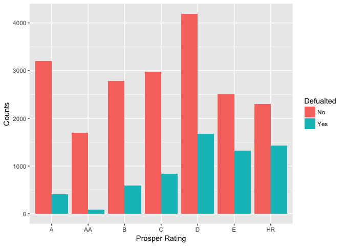
LoanStatusis the current status of the loan: Cancelled, Chargedoff, Completed, Current, Defaulted, FinalPaymentInProgress, PastDue. I created a new variable ‘check_default’ to group the status into two catagories: 0-‘completed’, 1-‘chargedoff’ or ‘defaulted’.
I plot ‘check_defaulted’ Vs. ProsperRating to see if the risk management system at Prosper really works. As shown on the plot, only a few borrowers have defaulted loans with Prosper Rating of AA. The proportion of defaulted loans in the lower rating groups are significant higher. For example, in the ‘HR’ group the defaulted loan is more than half of the completed loans.
StatedIncome vs. Default
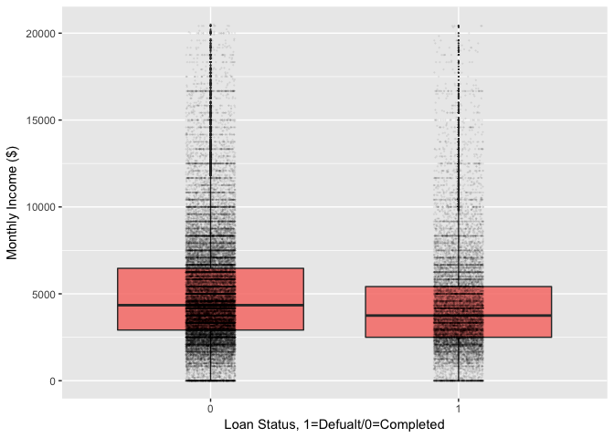
In this section, I studied the relationship between the stated income and the loan status. From the side by side box plot, I found that the mean stated income of the group that completed the loan is slightly higher than the other group. However, both group have many outliers and we need to perfume a statistical test to make the final statement.
## loan$check_default: 0
## [1] 5324.522
## --------------------------------------------------------
## loan$check_default: 1
## [1] 4450.824
Bivariate Analysis
Talk about some of the relationships you observed in this part of the
investigation. How did the feature(s) of interest vary with other features in the dataset?
-
In this section, I first studied variables that may have impacts on the borrower interest rate. From a scatter matrix plot, I filtered out some variables like the “CurrentCreditLines”, “EmploymentStatus”, “InquiriesLast6Months”, and “DelinquenciesLast7Years”.
-
Then I made a time series plot of the interest rates and found no clear seasonal or yearly trends.
-
Two factors that has “significant”” impact on the interest rates are are “ProsperRating..Alpha.” and “ProsperScore”.
-
Another feature can be used the predict the interest rata is “AvailableBankcardCredit” .
Did you observe any interesting relationships between the other features
(not the main feature(s) of interest)?
-
I studied the relationships between MonthlyLoanPayment and Occupations and found the top 3 occupations have high monthly loan payment are those have higher salaries.
-
I found a strong correlation between the loan status and the Prosper Rating, indicates that the risk management system at Prosper is efficient.
-
At last I studied the income and defaulted loan, and found no significant correlation.
What was the strongest relationship you found?
The strongest relationships I found is the Prosper Rating vs. Loan Status and the Prosper Score vs. Borrower’s rate. Prosper using borrower’s credit history and other information to evaluate their rike score. This score is represented as Prosper Rating and Prosper score. This feature is proved to be efficient to predict whether there will be a defaulted loan or not. So Prosper would be able to use this score to set the borrowe’s interest rate.
Multivariate Plots Section
Interest Rate vs. Time vs. Catagory
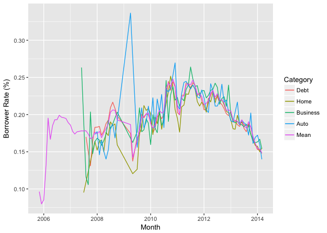
From the time series plot in last section, I didn’t get useful information about how the interest rate changes with time. So I included another variable (listing catagory) here to see if we can find any interesting trend for individual listings.
The lines for each catagory are similar with the mean plot except one huge jump for the auto loan in year 2009. But when look back to the first time series plot, I found there’s only a few data point within that time window. Thus any outlier was able to drive the line up.
Interest Rate vs. Time vs. Homeowner
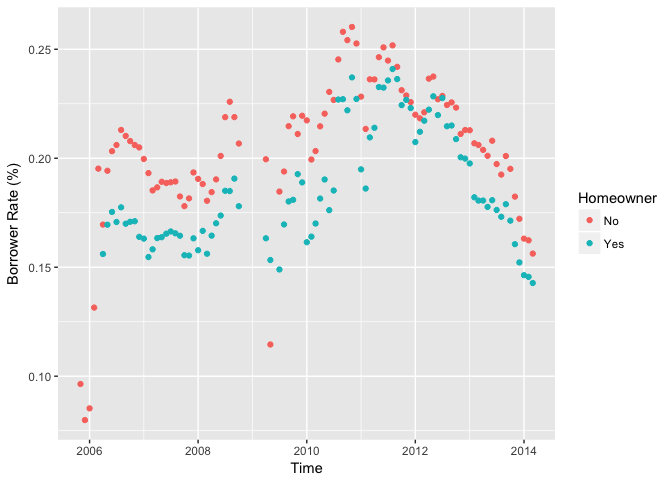
IsBorrowerHomeowner: A Borrower will be classified as a homowner if they have a mortgage on their credit profile or provide documentation confirming they are a homeowner.
From the following plot, it is clear that the interest rate for homeowners are generally lower than non-homeowners. Homeowners usually have lower risk of making defaulted loans since bank can use their house as collateral.
Multivariate Analysis
Talk about some of the relationships you observed in this part of the
investigation. Were there features that strengthened each other in terms of looking at your feature(s) of interest?
-
The time seriers plot of borrowers’ rates groupby listing catagories didn’t reveal any new findings.
-
However, by adding the Hmeowners information to the time series plot I found clear tren d that homeowners tend to get lower interest rates.
Final Plots and Summary
Plot One

Description One
BorrowerRate and Borrower APR are the variables that I am interested in the study because they are the most important numbers borrowers care about when make loan. So I first ploted the distributions of this two variables. According to above definitions by Bank of America, the distribution of BorrowerAPR and BorrowerRate should be similar with slight difference since the APR is always higher than the interest rate. The plots also illustrate similar distributions.
Plot Two

Description Two
I plot ‘check_defaulted’ Vs. ProsperRating to see if the risk management system at Prosper really works. As shown on the plot, only a few borrowers have defaulted loans with Prosper Rating of AA. The proportion of defaulted loans in the lower rating groups are significant higher. For example, in the ‘HR’ group the defaulted loan is more than half of the completed loans.
Plot Three
Description Three
In this plot I studied the relationships amoung three variables: borrower rate, time, and whether the borrower is a homeowner or not. This colored scatter plot illustrates the fact that the homeowners got lower interest rate in general throughout the years.
Reflection
In this project I selected a dataset from Prosper.com which includes 81 variables and 113,937 observations. With so many variable it was hard to get started without any financial knowledge. Thanks to Propers.com who provided detailed description for each variable. So the first step before conducting any data analysis is to understand the meaning of each variable. After reading through the descriptions and definitions, I chose ‘BorrowerRate’ as my target variable since this number matters a lot to a potential borrower.
The next step is to get to know the variables. In R, we can use some summary functions to get some general ideas about the dataset. For example str(data) gives us the structure of the dataset, summary(variable) gives us the summary statistics of variables. Another approach is to use data visualizations. For individual variable, histogram and boxplot are good way to show their distributions and identify outliers.
After get some ideas of individual variable, we can move to next step and start to explore the relations among variables, especially those related to our target variable. Scatter plot is most commonly used plot to show relations between two variables. In this project, I first made a scatter matrix which shown multiple comparisons at once. From the scatter matrix we can filter out some variables that have weak correlations with the target variable. For those have stronger correlations, we can further study their relationships.
A simple way to show relationships among multi variables is to add colors to the plot. Using different colors to represent factorial variables. The point size of the scatter plot can also be used to represent numerical variables with larger size associated with larger numerical values.
Limitations
The Exploratory Data Analysis is a good way to know the data using vivid and interesting visualizations. However, to make final statement about the relationships among variables we need to conduct statistical test and build predictive models.